
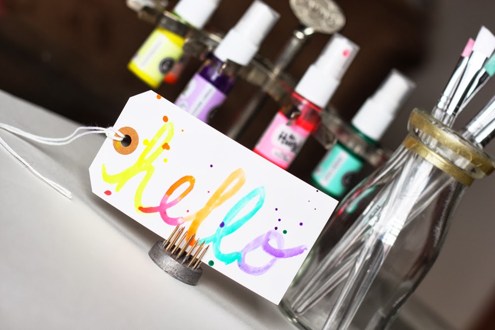
If you came to brush up on the latest there is to know about the art of creating a brush script, you're probably in the wrong spot. Scratch that—you are in the wrong spot. But if you came to see a novice test her hand at this art of creating a script font using liquid color, I'm happy to welcome you aboard!
Over on the Scrapbook & Cards Today blog, I share a great deal about the up-and-coming trend of brush script. I invite you to take a look for more about products available, trend experts and artists, and even classes being offered on creating this cool look.
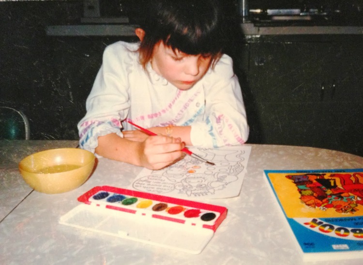 |
| Painting at Grandma's house. Circa... 1988 (ish). |
Here, I'm simply going to explore a few self-taught approaches to creating my script using a paintbrush and two different forms of ink: spray and dye. I've always LOVED playing with paint and paper, so this was a fun world to explore.
Spray Ink Painting
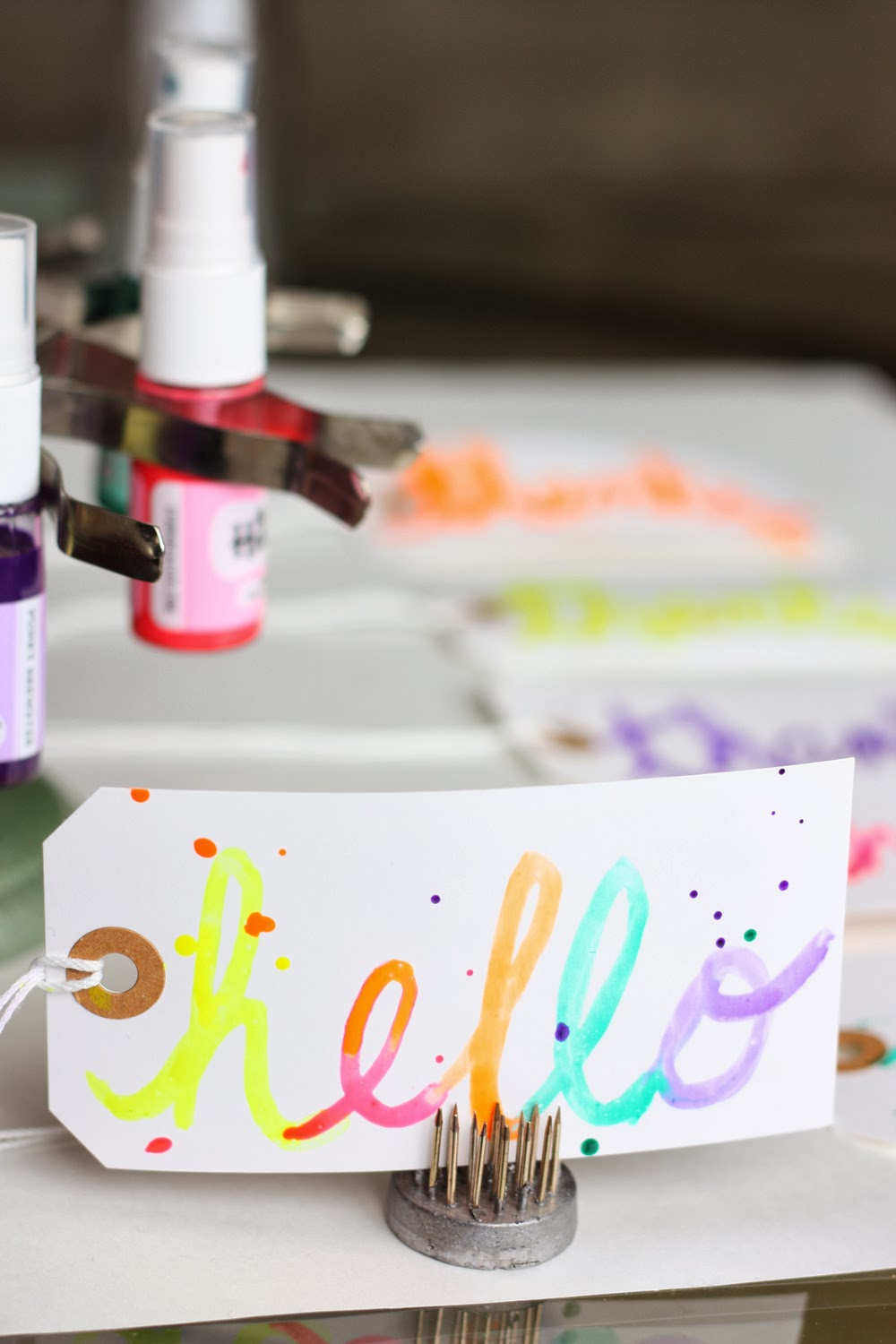
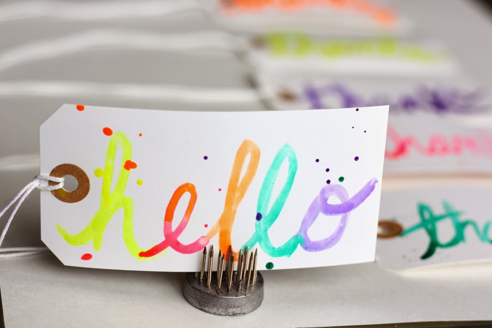
Let's start with spray. These are the tools I used:
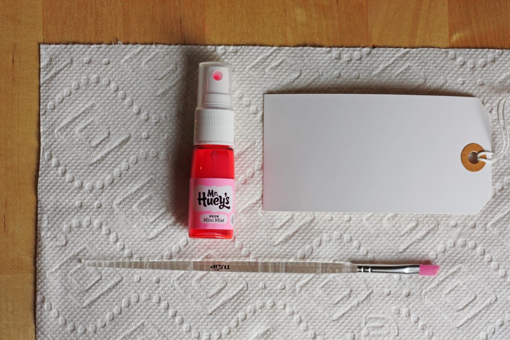 |
| Mister Huey's spray ink by Studio Calico; shipping tag from Office Depot; paper towel c/o Mr. Brawny; Tulip paintbrush by iLovetoCreate |
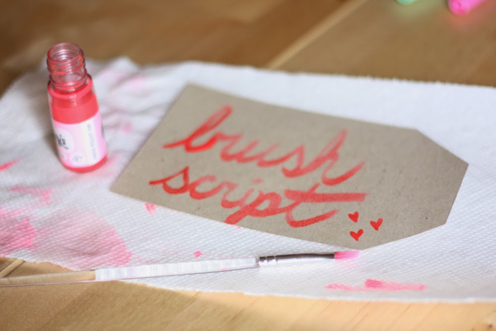
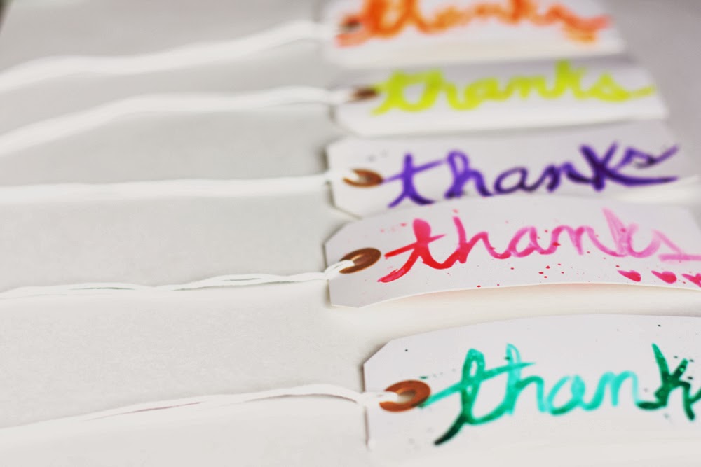
First things first—the ink. I simply unscrewed a bottle of my Mister Huey's spray ink and dipped my brush right in. No muss. No fuss.
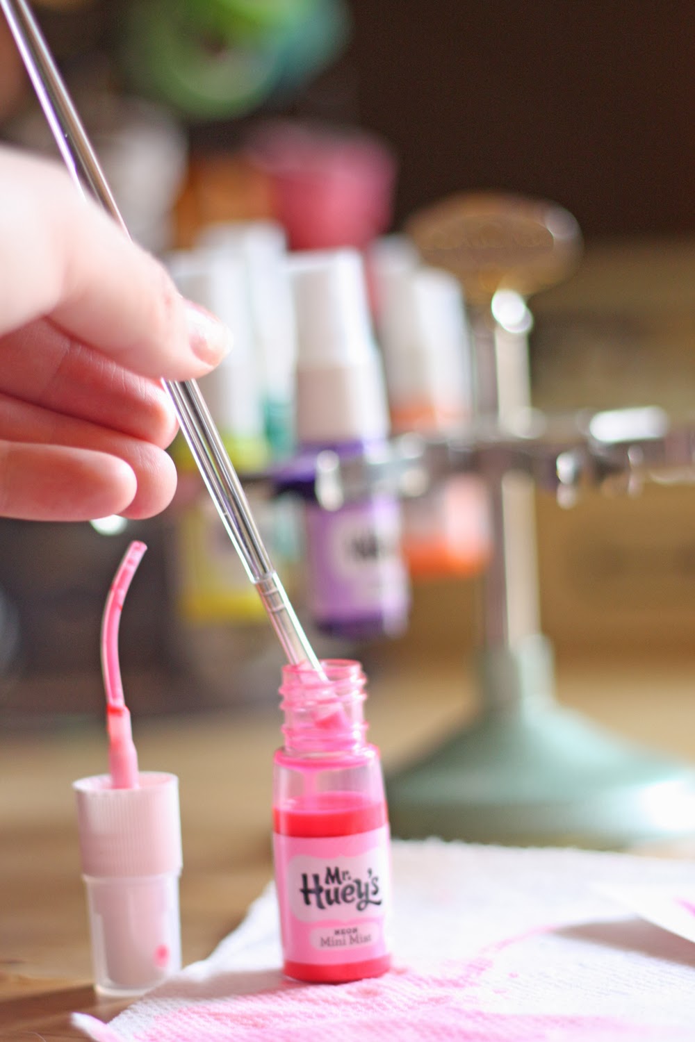
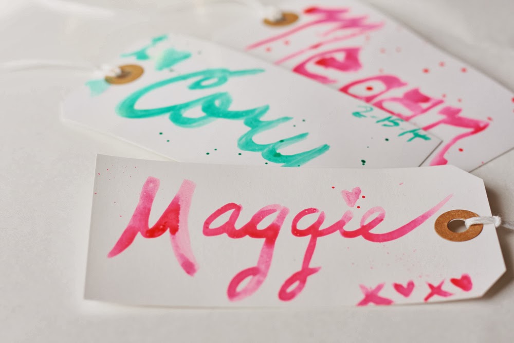
I practiced on basic shipping tags, though any paper surface should do. Ideally, I imagine watercolor paper would be the way to go, but I'm not certain about this. And I didn't have any on hand, so the shipping tags would have to do.
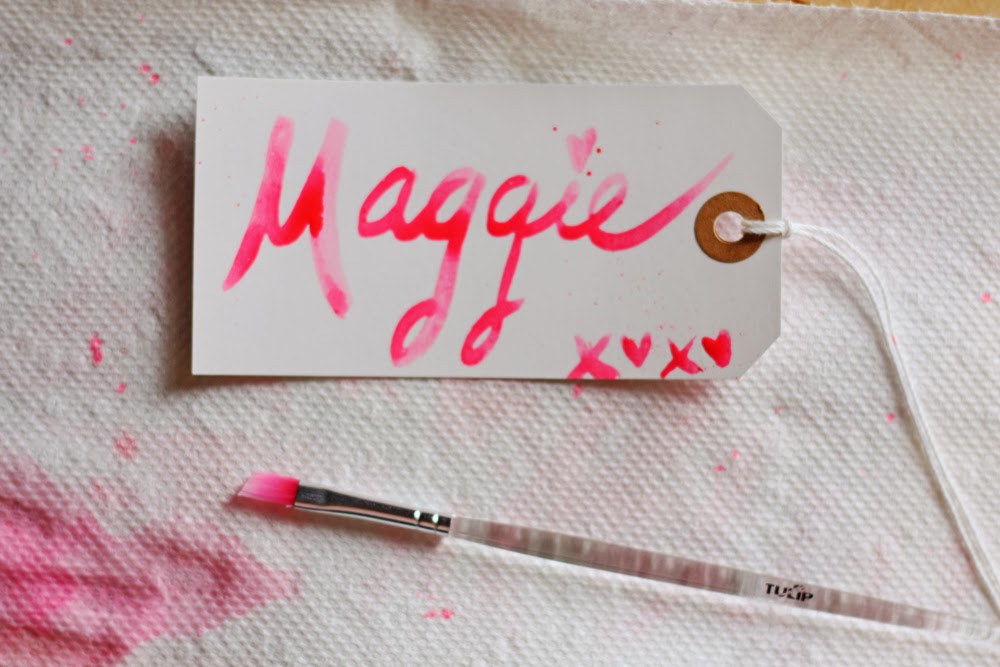
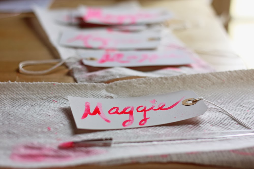
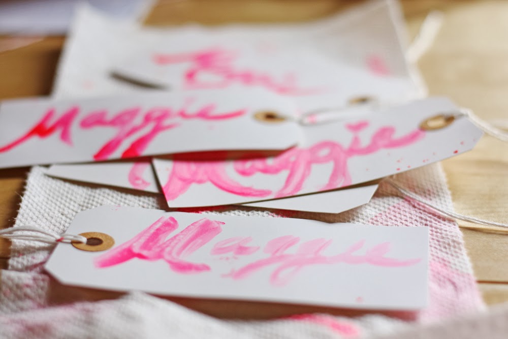
As you can see, it takes some practice to get the hang it. Good thing I have a massive box of shipping tags, eh?
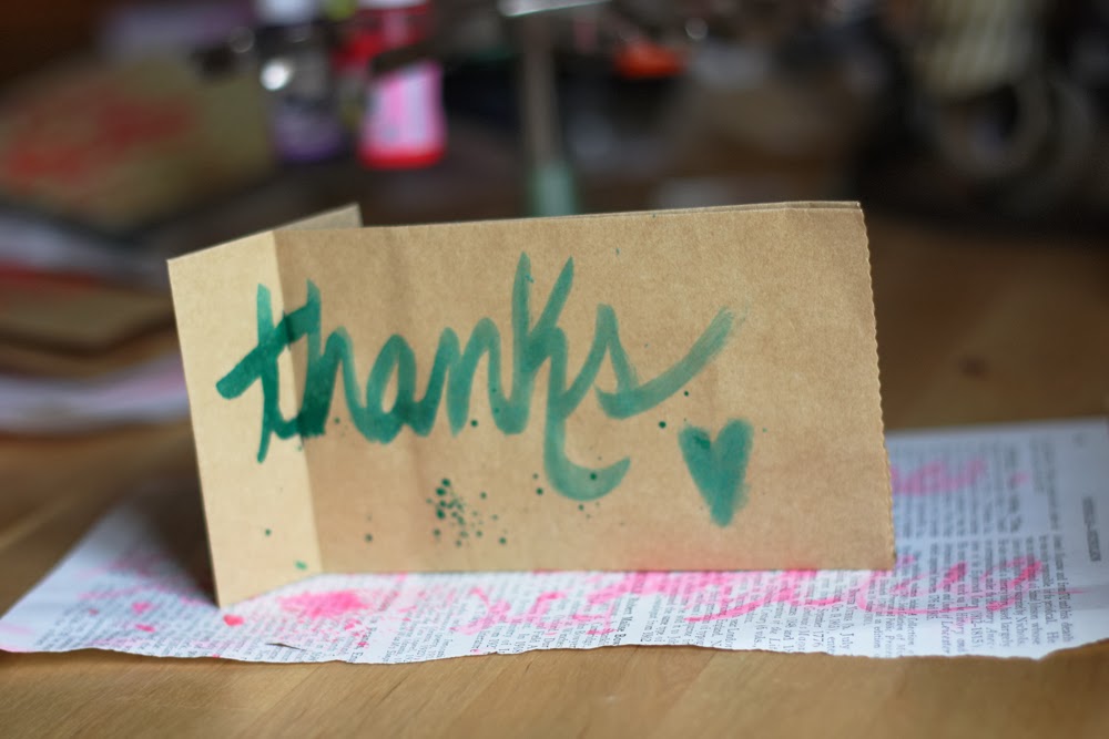
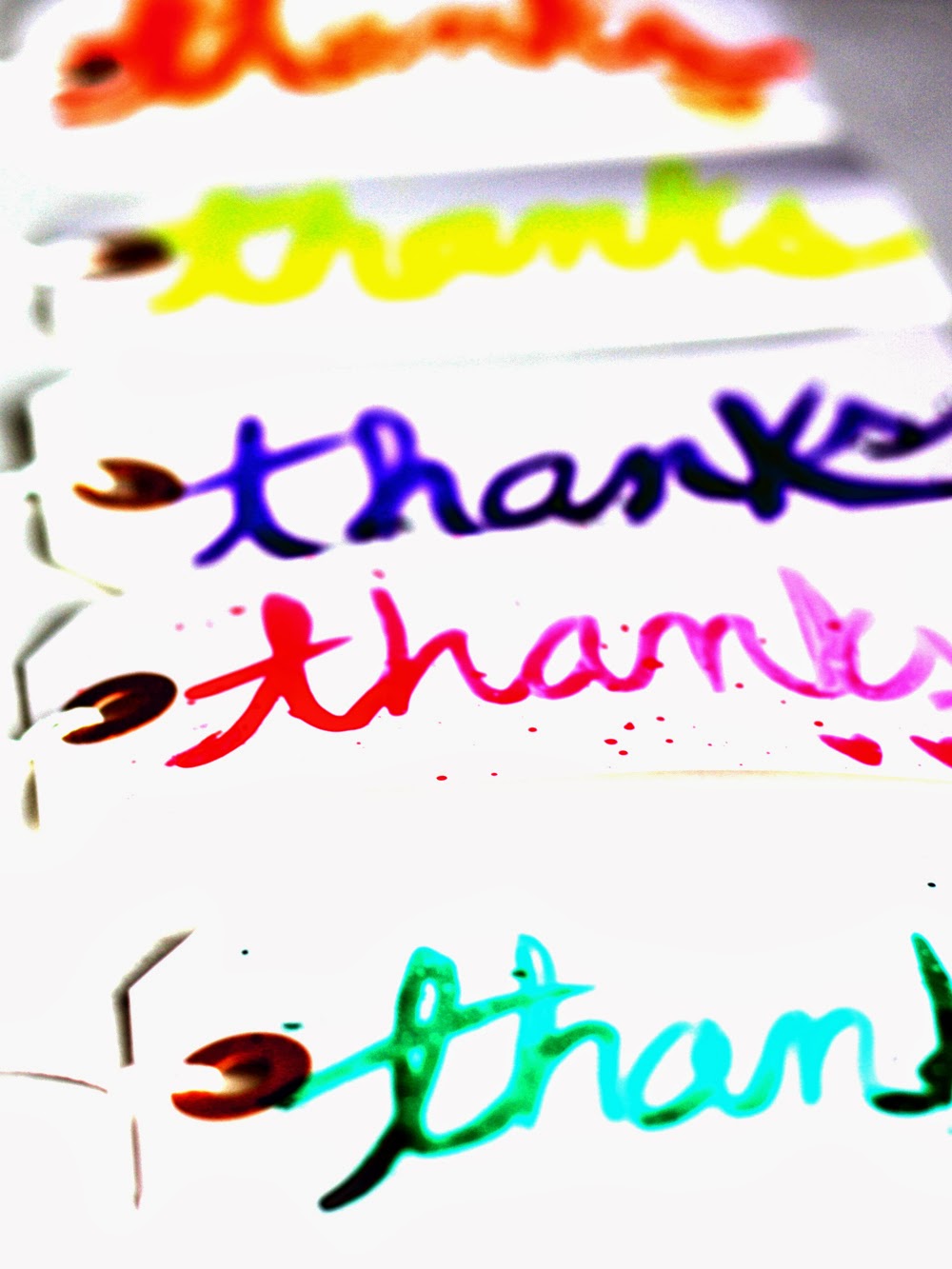
I thought it would be fun to turn the tags into thank-you tags to go with the handmade goods I occasionally sell, so I set to writing many "thanks!"
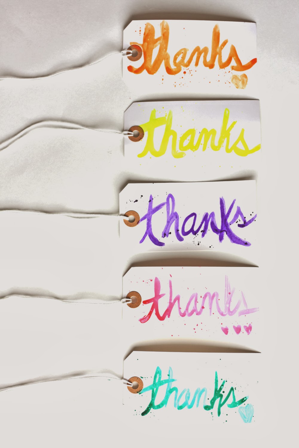
To create the splatter effect, I simply held the nozzle of my Mr. Huey's bottle above the tag and tapped on in . I did this after I wrote "thanks."
I liked practicing the same word over and over for a few reasons:
1. I could compare and contrast outcomes as I painted at different angles/different amounts of pressure/different quantities of ink/etc.
2. I could see how the effect would change with different ink colors.
3. Like snowflakes, no two pieces of brush script art are going to be identical. It's fun to see how they each get their own splash of personality.
This hobby is so fun, I even managed to convince Cory to try it with me. He's a good sport!
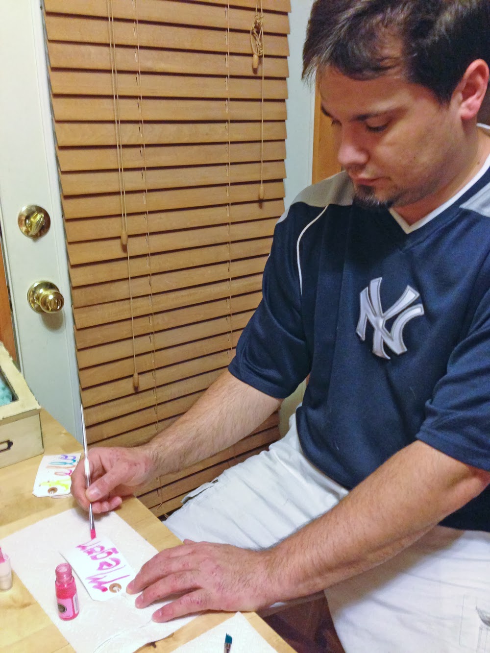
I love how everybody's handwriting is going to make their brush script unique!
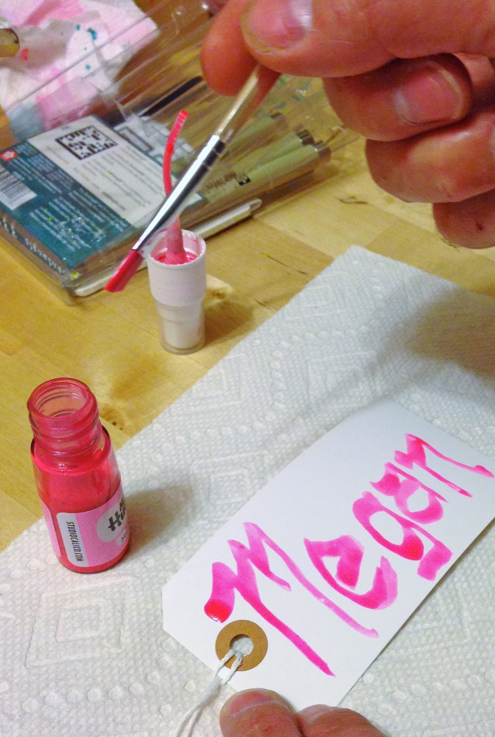
Yes, it was a regular family affair.
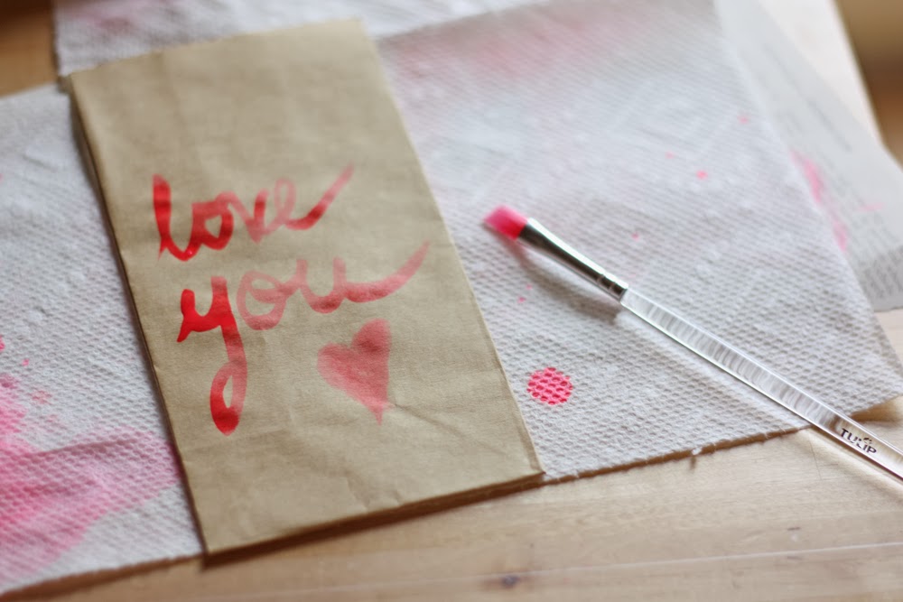
Eventually, I spread my wings and tried other surfaces, such as little gift bags.
Now, all I needed was a little clothespin (Crate Paper) to make a Valentine's Day package for Miss Maggie D.
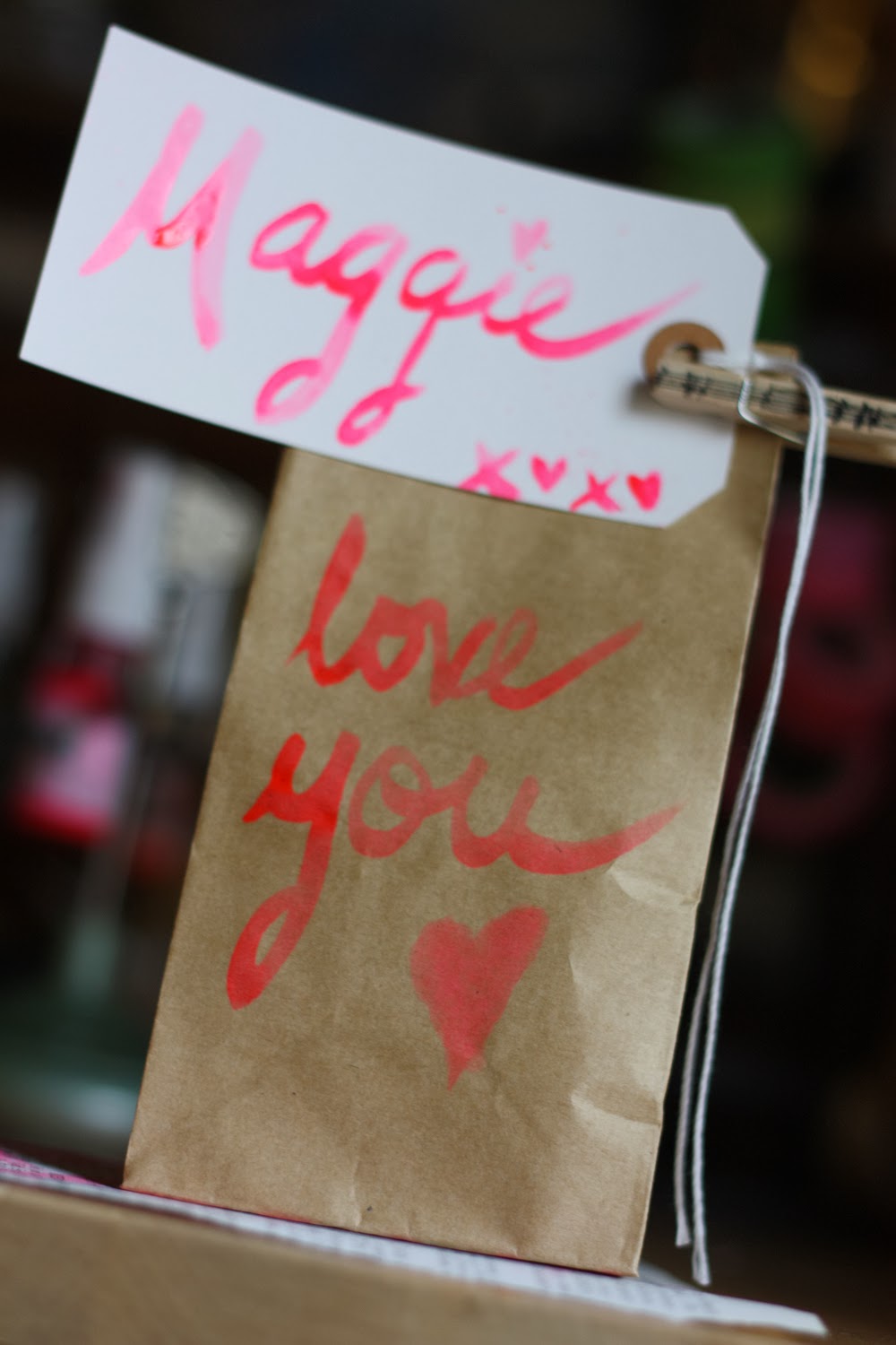
From bags, I decided to get real carried away and go multi-color with my strokes. Whaaaaat?!? Yes, it's true!
To do this, I would suggest starting with the lightest shade and progressing to the darkest to avoid ink cross contamination.
A few things I picked up along the way:
1. Drag the brush at the beginning and end of words to enhance the look (like the U on my bag above). It looks more hand-painted this way or something (vs. making a clean cut at a word's end).
2. If you're using a flat brush, as I was (probably not the ideal choice), hold it on its side for a finer font.
3. Be careful where you start and stop. The start/stop marks will show. I did my best to complete an entire word before lifting my brush, and then I'd simply go back over areas as needed. NOTE: Don't over go-over. You can quickly add too much color by going back over. I messed up many a tag this way.
Know Before You Go
As I've said, I'm far from a trained expert on the matter. If you're seeking more formal training (and who could blame you?), I suggest you check out Studio Calico's new Life Scripted online class, happening now. It looks like lots of fun, and students have had great things to say about it.
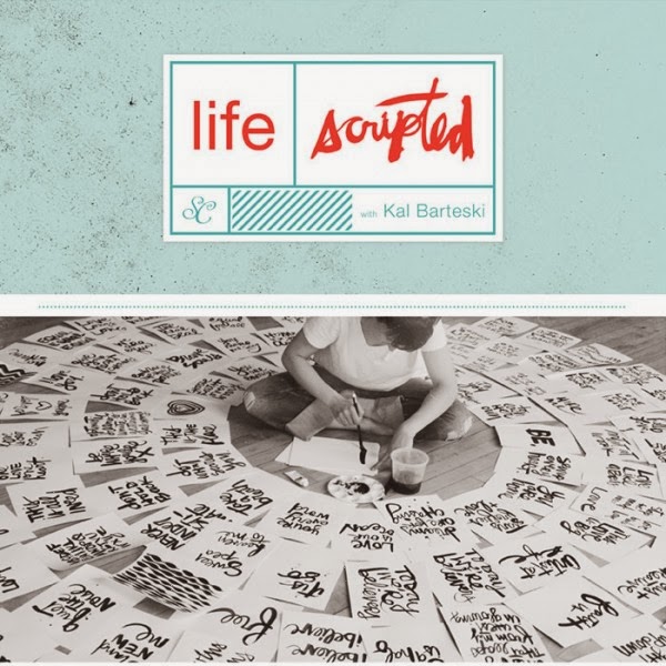 |
| Image credit: Studio Calico |
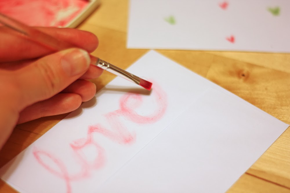
Back in the day, I worked for Stampin' Up!, where I learned this cool tidbit—If you squeeze your stamp pad when it's closed, a pool of ink will form in the lid.
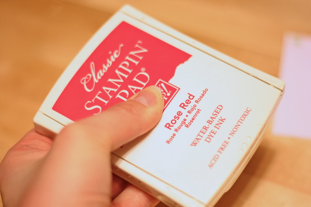
Okay, maybe "puddle" is the more accurate word, but it's enough ink that you can dip your paint brush and use it to try a round of scripted painting.

So I dipped a toe... errr, brush, and tested the dye-ink waters.
How does this compare to spray ink? Let's pro and con!
Pro: It's easier to control because your brush is dryer.
Con: It has a less artistic look to it (in my opinion).
Pro: It's more even coverage (if that's the look you seek).
Con: It's harder to see.
Hmmm... I suppose there's a time and a place for both approaches.
I then decided to add little hearts to my envelope. Here's how this is done. First, hold your brush at an angle, slanting it on the diagonal, and rub it back in forth on the paper.
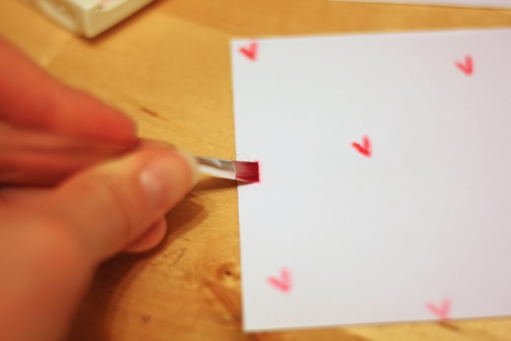
Repeat. This time, going at the opposite diagonal, to complete the heart.
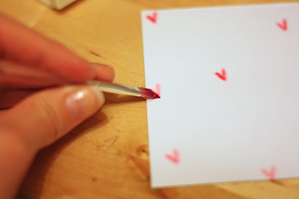
You don't have to reapply ink to the brush between each heart. If you don't, some will have less saturation and others more, giving the project more depth.
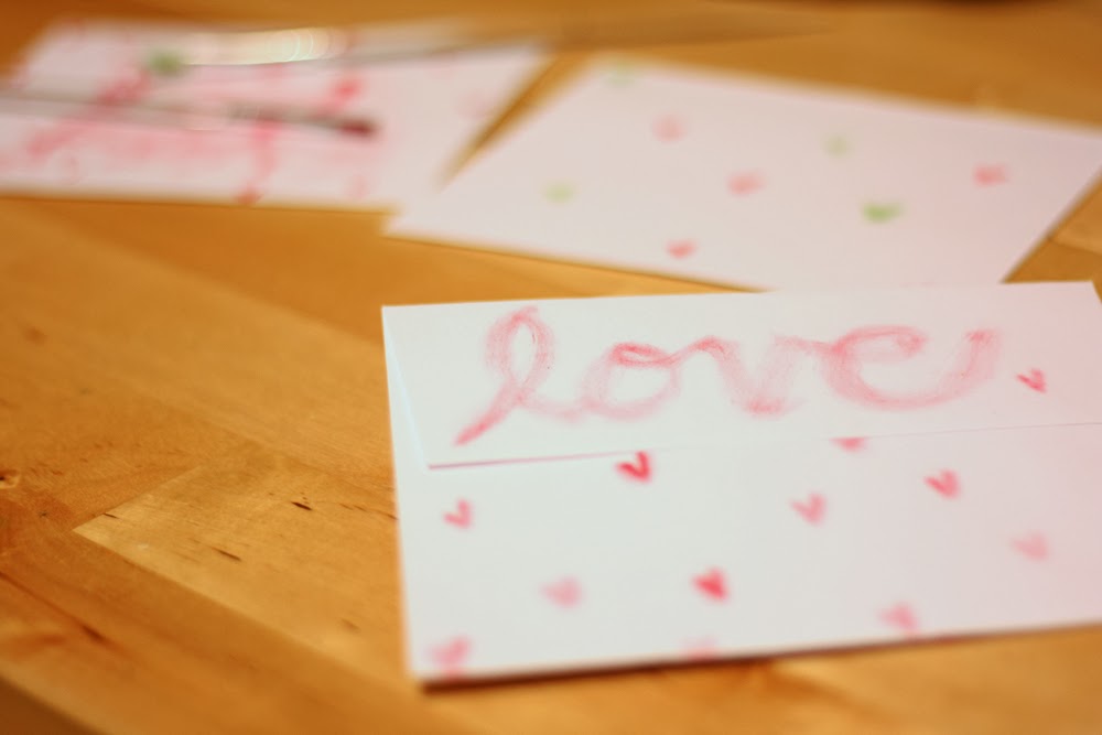
Will, that's all she wrote. While this is far from the Brush Script-ures, I hope my trial and error process has offered you some insight as you approach your own projects. And I'd love to know which approach— spray ink or ink pad — you like better.
Thanks for stopping by!
Cheers!