Monochromatic Madness with Whisker Graphics: A layout & a card


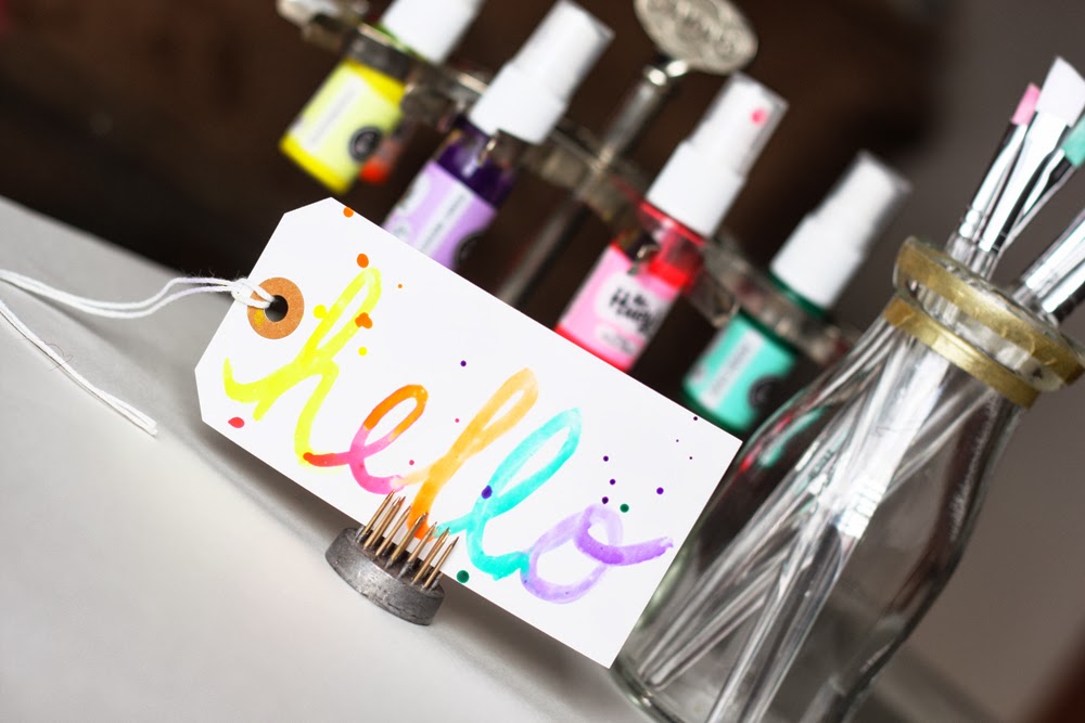
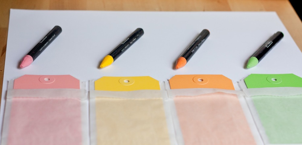
I've gone mad, I tell ya! [said in my best mad-scientist voice] Okay, perhaps I haven't completely lost it, but I am pretty coo-coo for color. Especially the various trends on the crafting scene that incorporate painting. So when the awesome loves at Whisker Graphics asked me to select a few products to work with here on the ole blog, I was instantly drawn to these gorgeous tags!


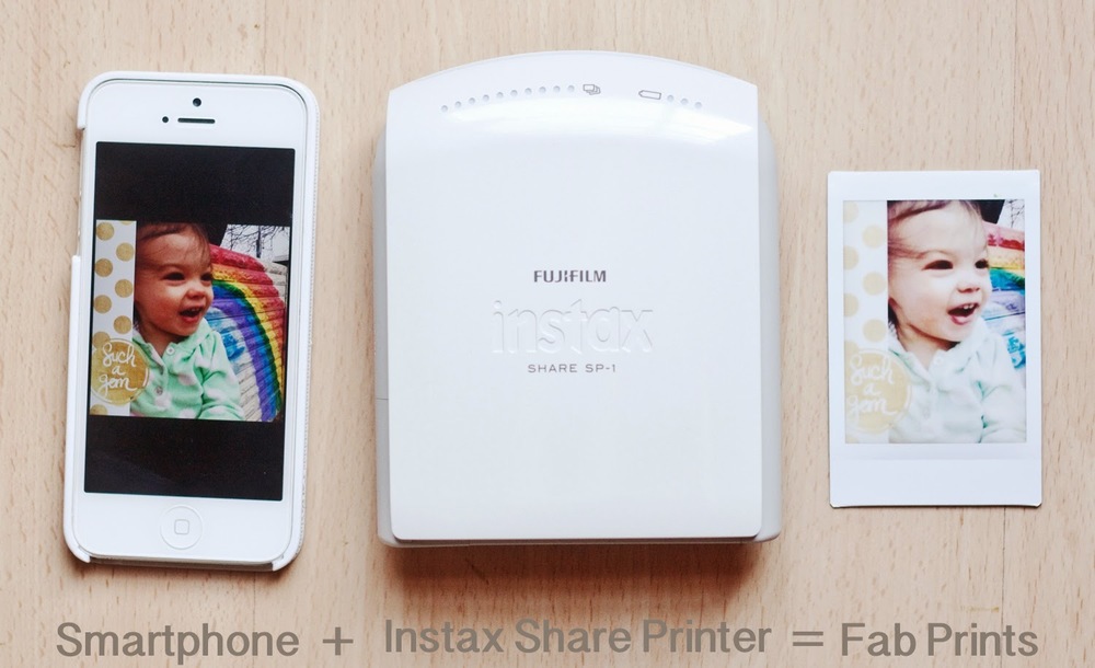
They were just the right size for putting my new Instax Share Printer to work on a layout. Here's how my page began:

Do It To It: The Photos
Knowing I wanted to document a few photos I snapped of Mags in front of a cool rainbow wall downtown, I added those pics to my photo's camera roll and printed them to my Instax Share Printer using the free Instax app. I'll have to go into this in more detail in another post. But I can tell you this printer rocks my socks!


The Polaroid-style film fits perfectly on the large tags, and my prints were ready in minutes!


Do It To It: The Background
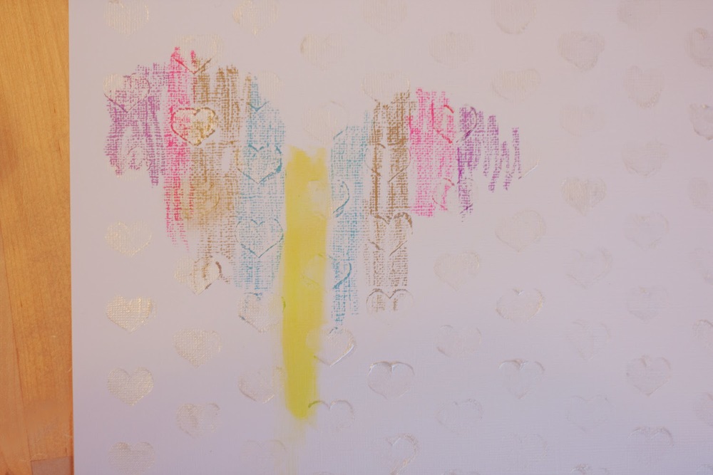
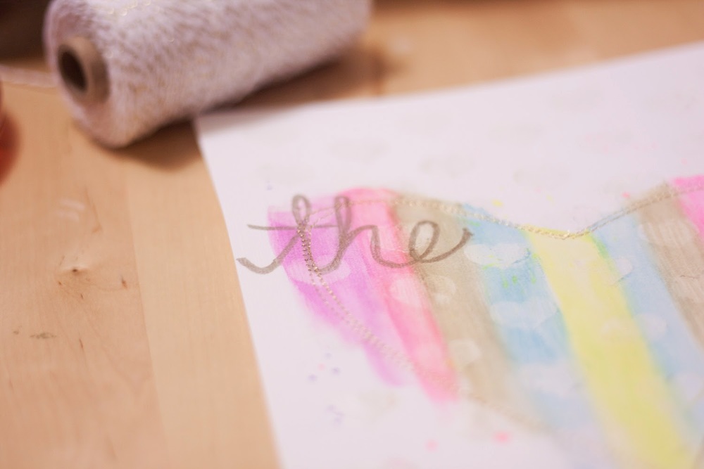
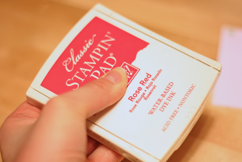
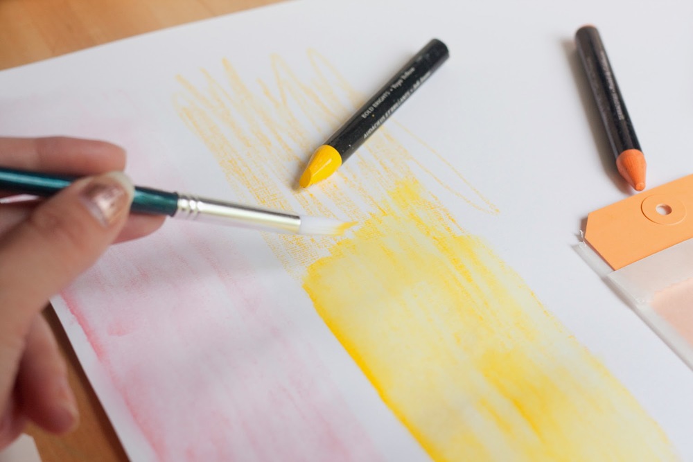
For the background, I grabbed my Watercolor Wonder Crayons from Stampin' Up! and set to work on creating my own colorful cardstock, using the colors of the tags as my inspiration.


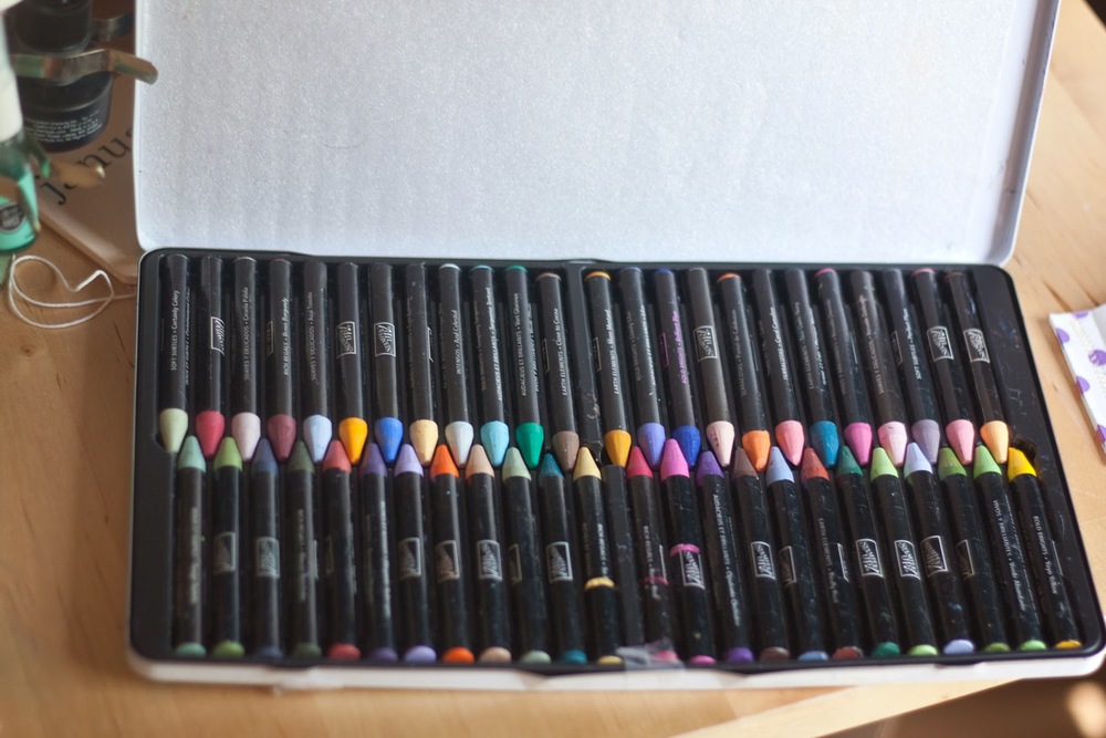
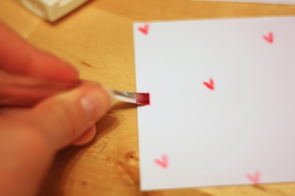
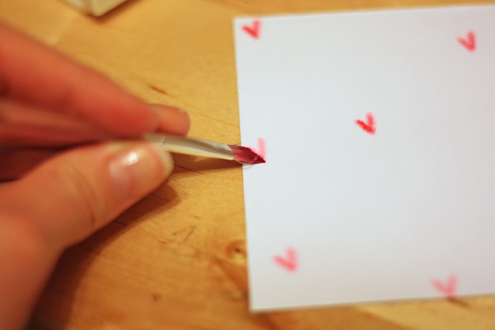
First, I colored four columns—no fancy business here, just some shloppy scribbles will do.


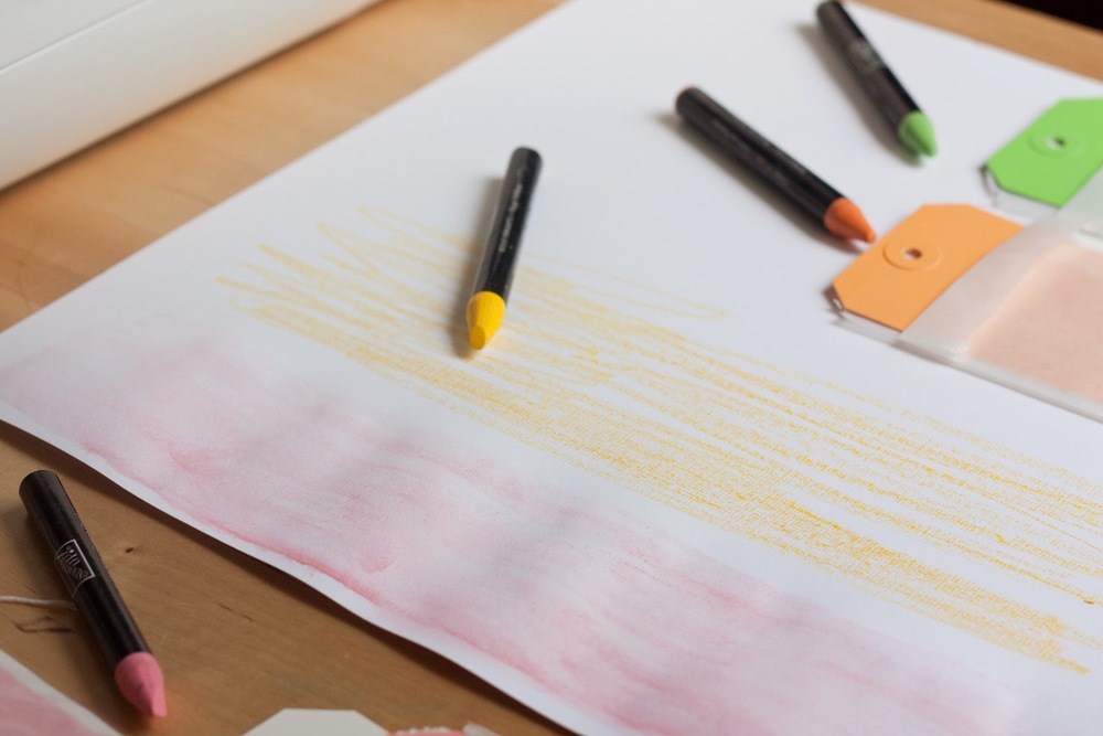
Then I took my brush, some water, and set to blending the crayons, creating a soft, watercolored backdrop for my tags.


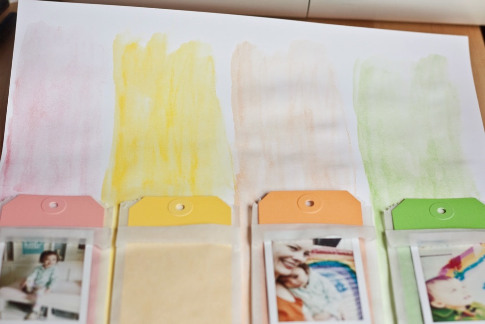
Once things were dry, I trimmed the 12x12 down to 11x11 (approximately) and matted it to heavy-weight gold cardstock, using my sewing machine. The reason being, the paper curls a bit when you watercolor, and anchoring it to heavy-weight cardstock keeps it flat and secure.


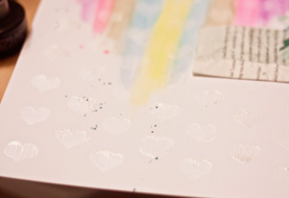
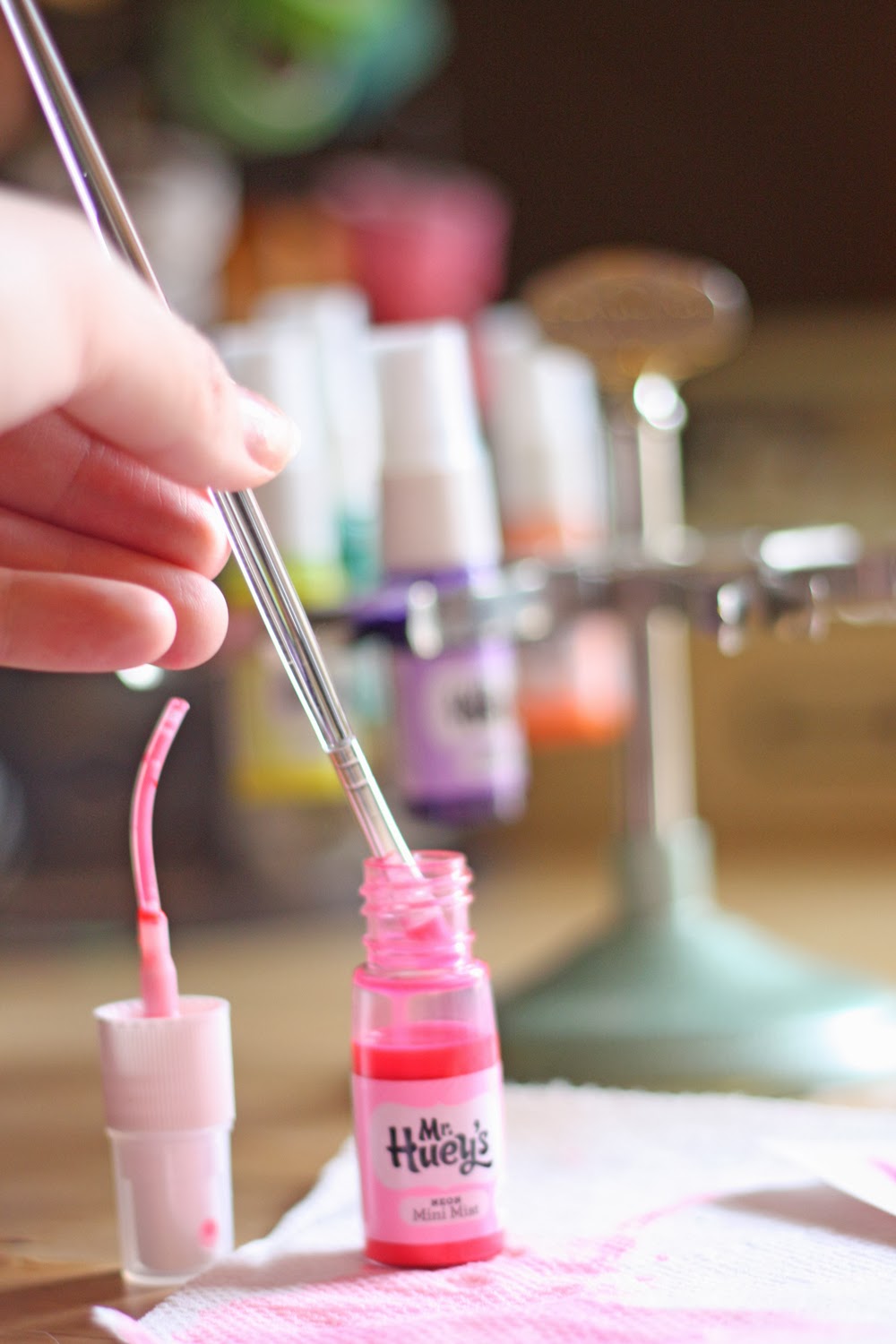
Next, I applied a bit of spray ink to the page for a splattered effect. I did my best to stick with the monochromatic-ness of it all, but the ink tends to wander. I'll be honest, I'm not in love with this detail and would probably change it if it were a simple fix, but I'm not about to start the page over now when I only sort of dislike. KWIM?


Do It To It: The Title
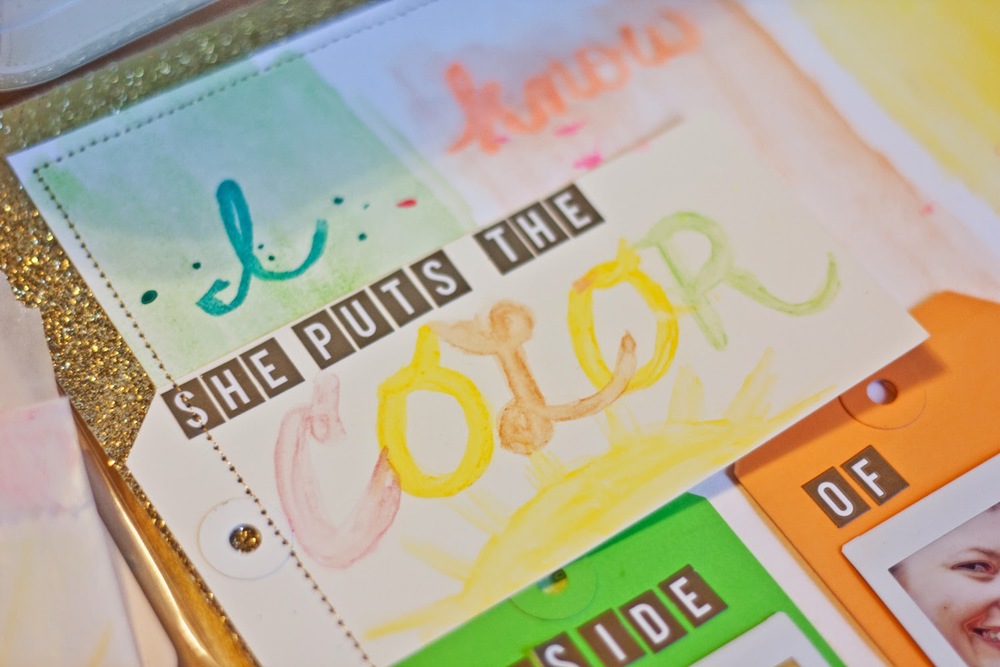
Inspired by the first line in John Mayer's song, "Daughters," I reached for my spray ink again to write "I know a girl." Like this idea, but the yellow tone-on-tone proves a bit tricky to read. Especially in the photo. It's not so bad here at home.

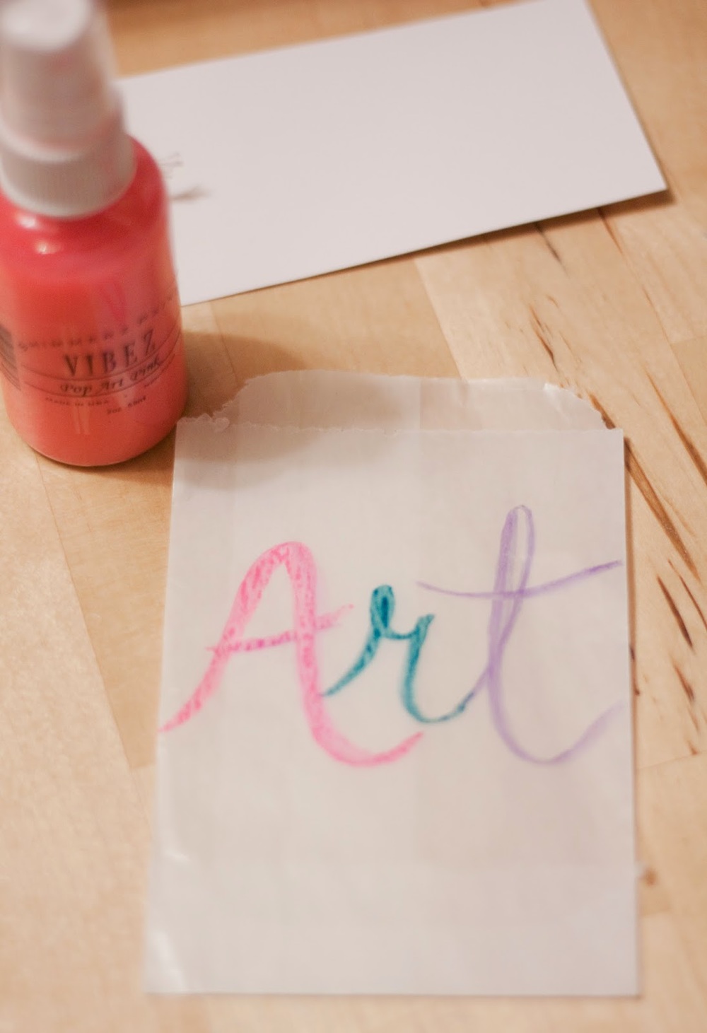
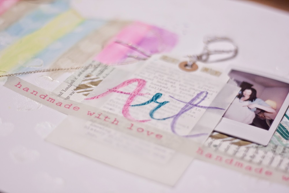
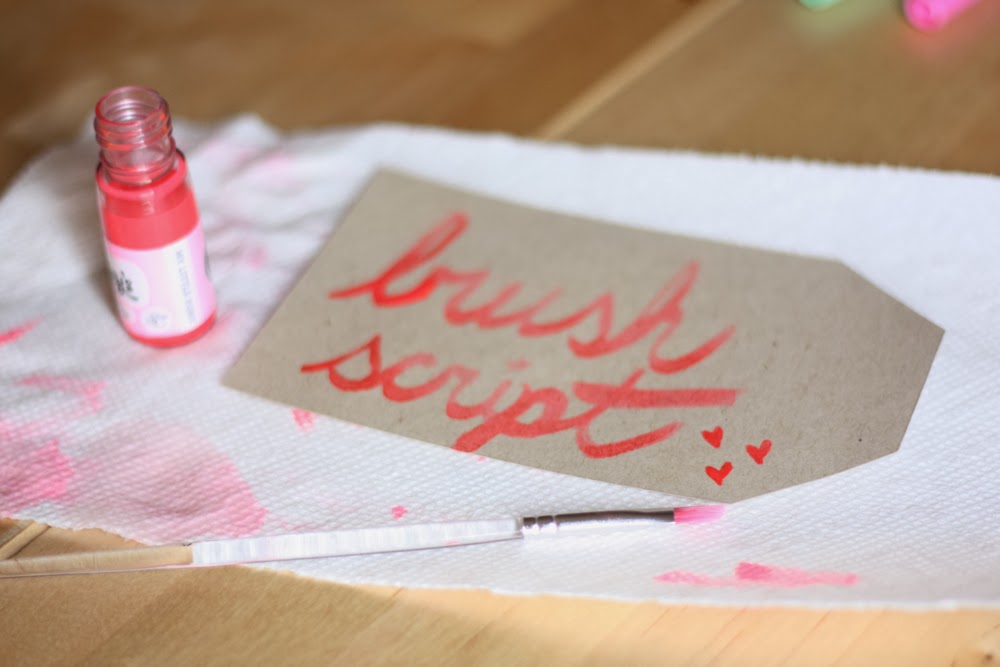
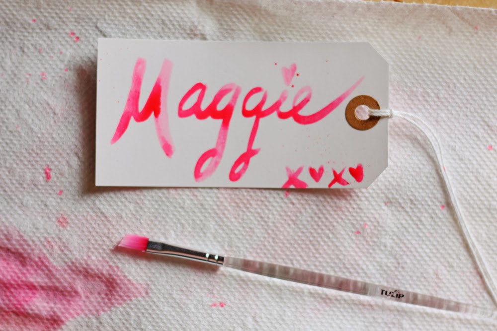
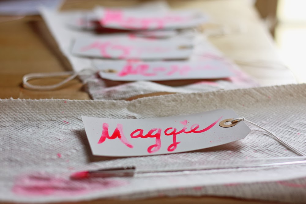
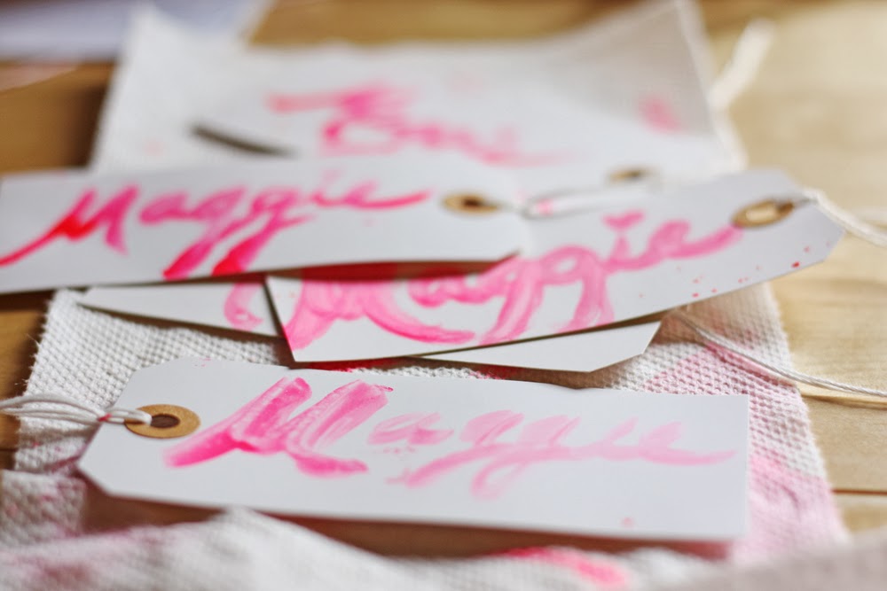
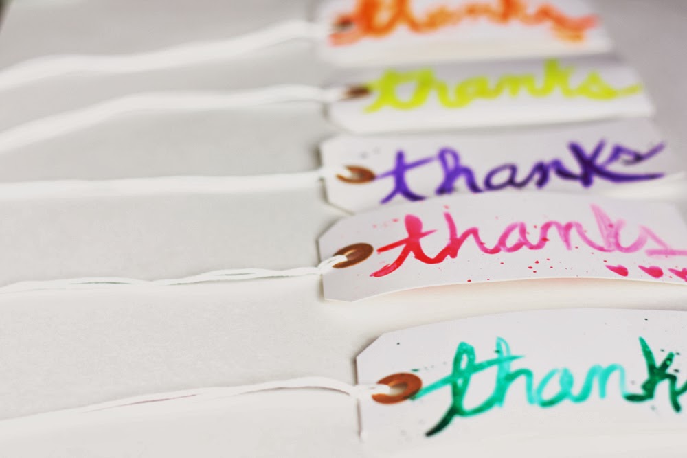
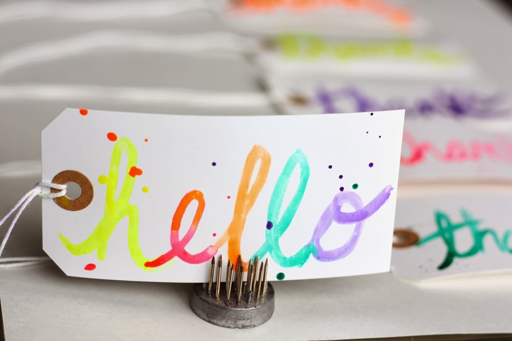
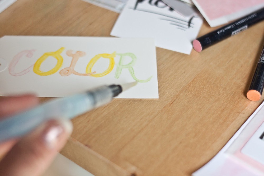
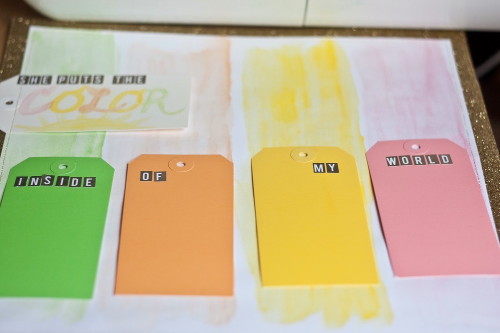
For "She puts the color," I used a large white shipping tag from Whisker Graphics.


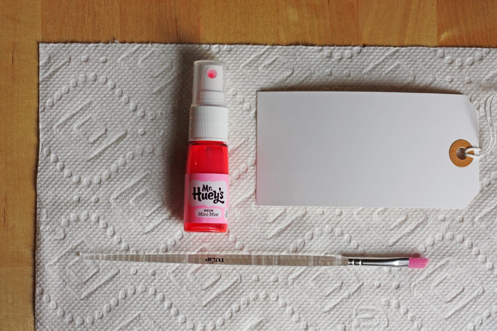
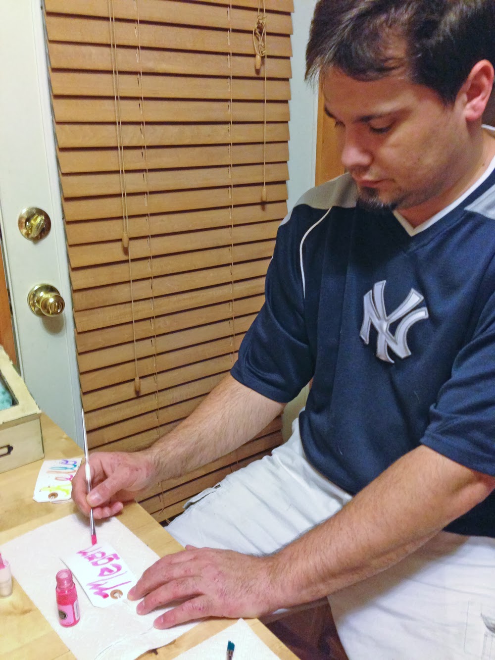
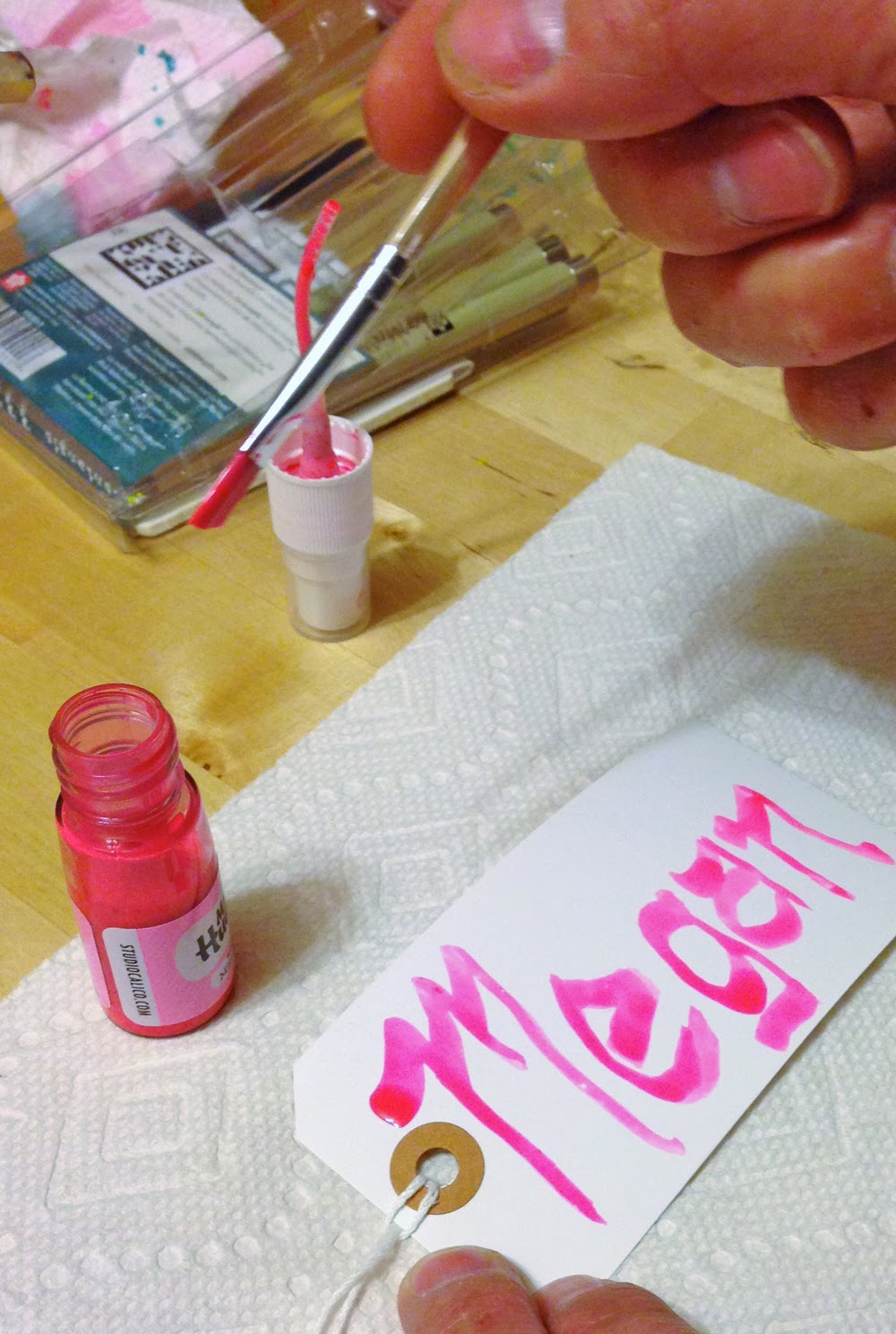
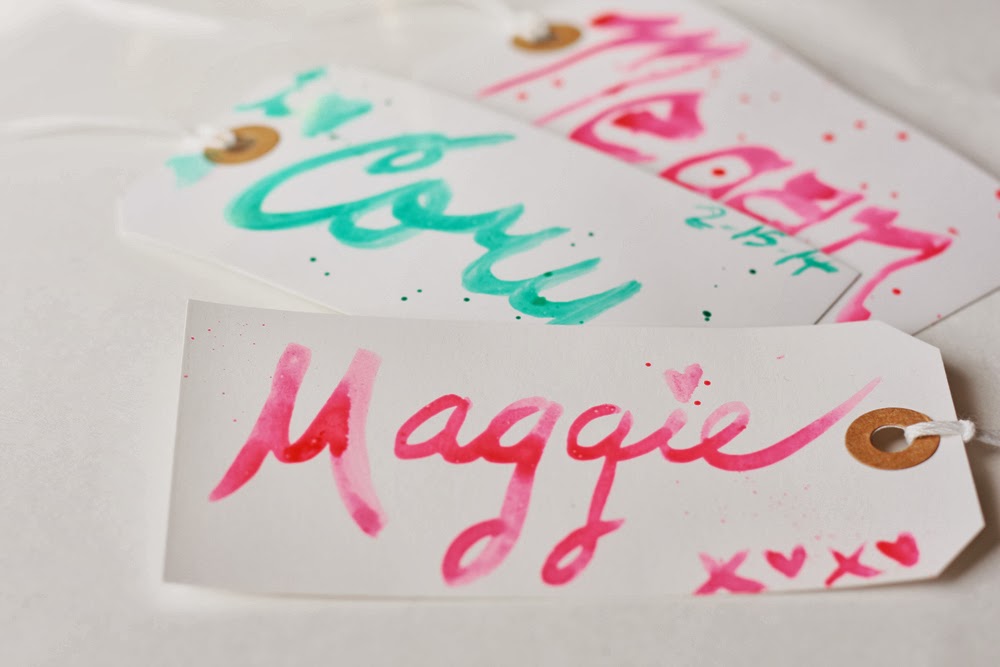
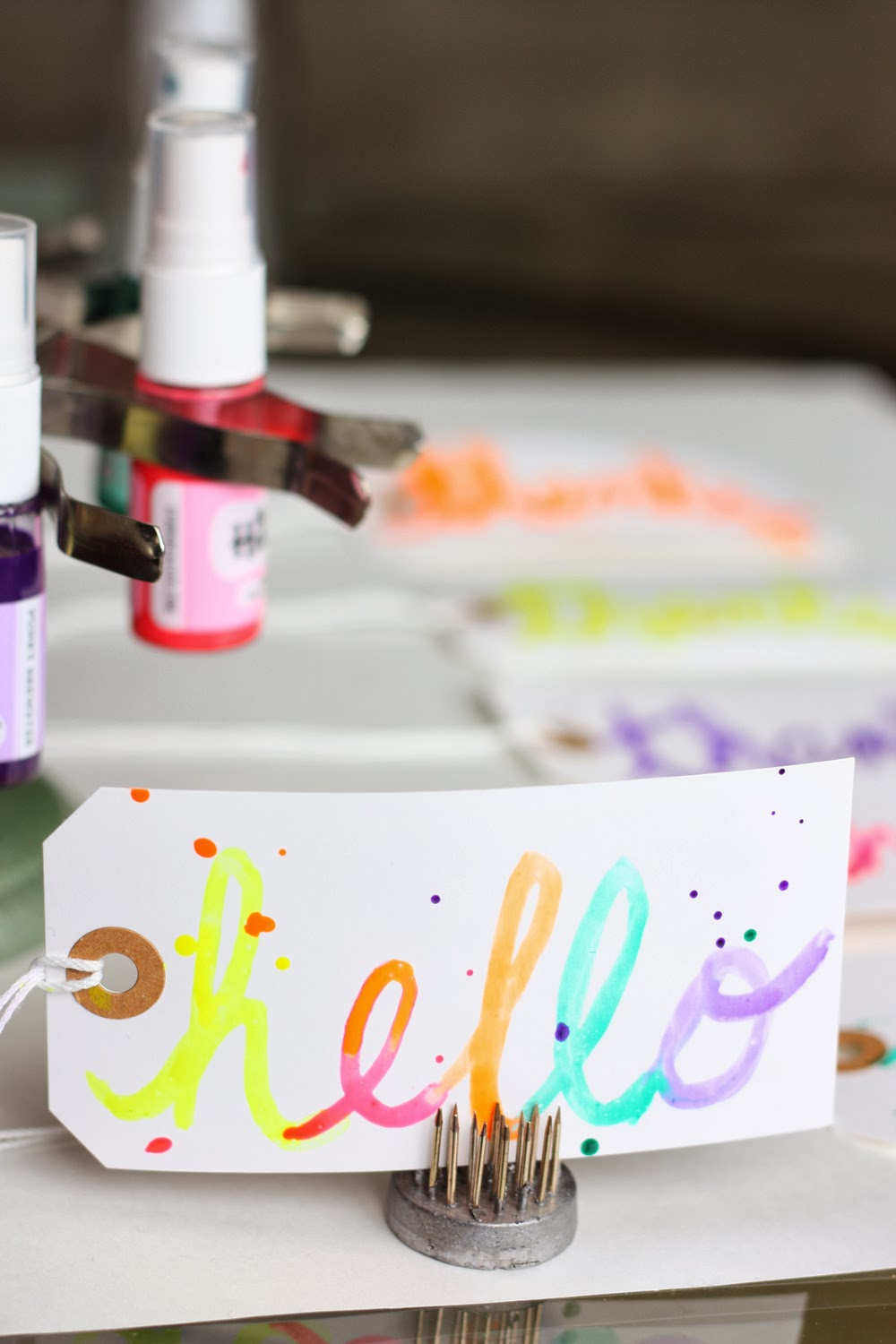
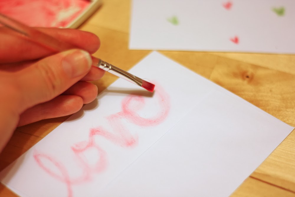
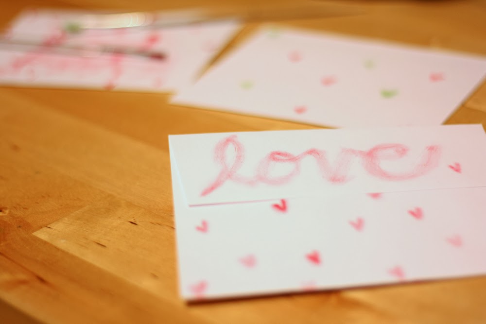
I actually wrote "color" with my Watercolor Wonder Crayons and used a water brush to blend the letters—a very cool way to create a watercolored brush script. You should try. Just go easy on the water and don't be afraid to apply more crayon color as needed.


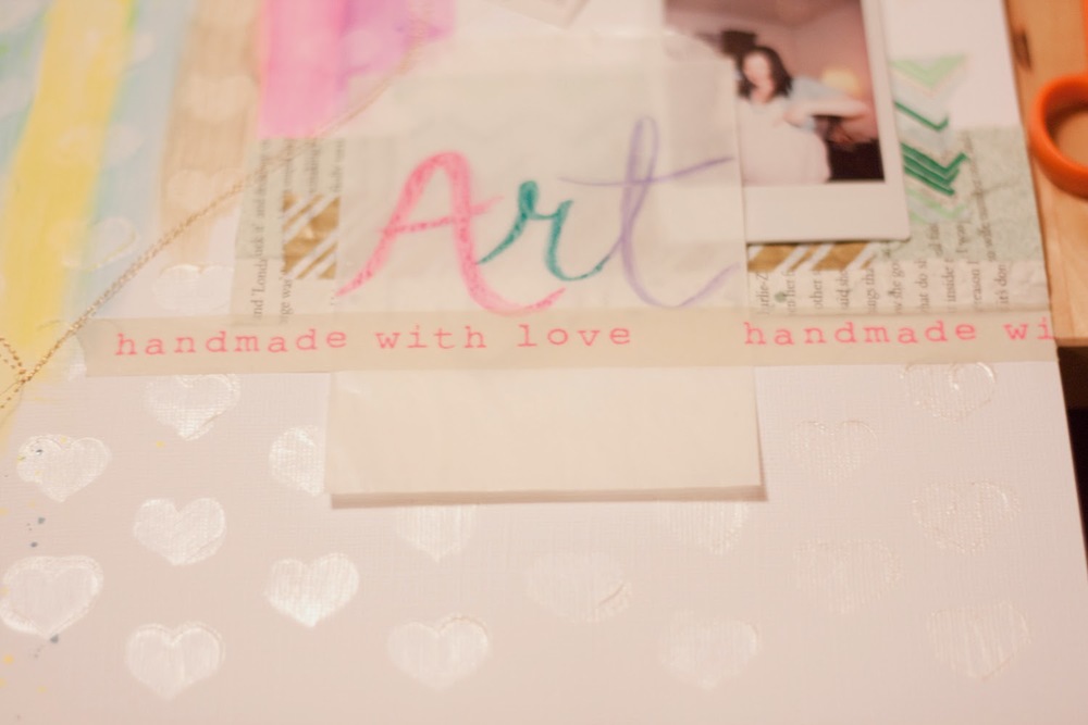
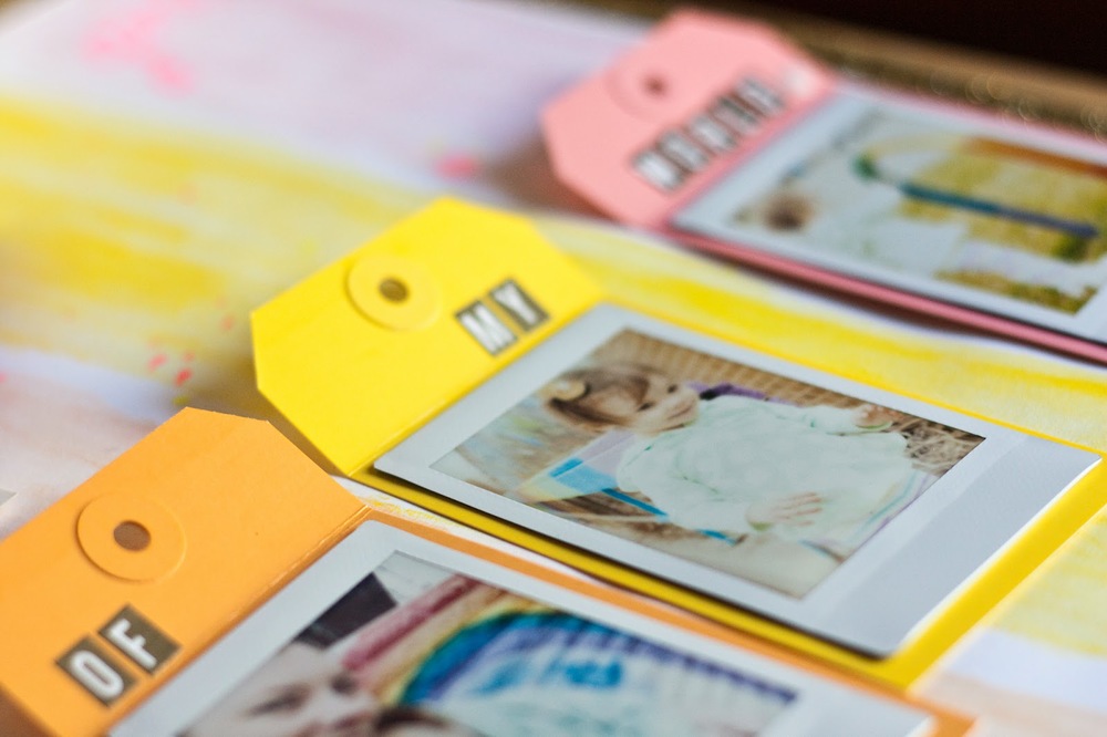
I completed the line—"inside of my world"—by adding Studio Calico stickers to the tags holding my stickers.


Is the song stuck in your head now? It's been in mine for days. If not, let's see if I can help you out. ;)


Do It To It: The Journaling
Wanting to tell the full story of my lovely rainbow-wall I find in downtown Salt Lake City, I knew I'd need ample page space, but I didn't want to disrupt the simplicity of the design, so I incorporated hidden journaling beneath the tags.


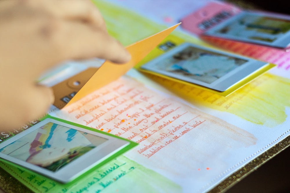
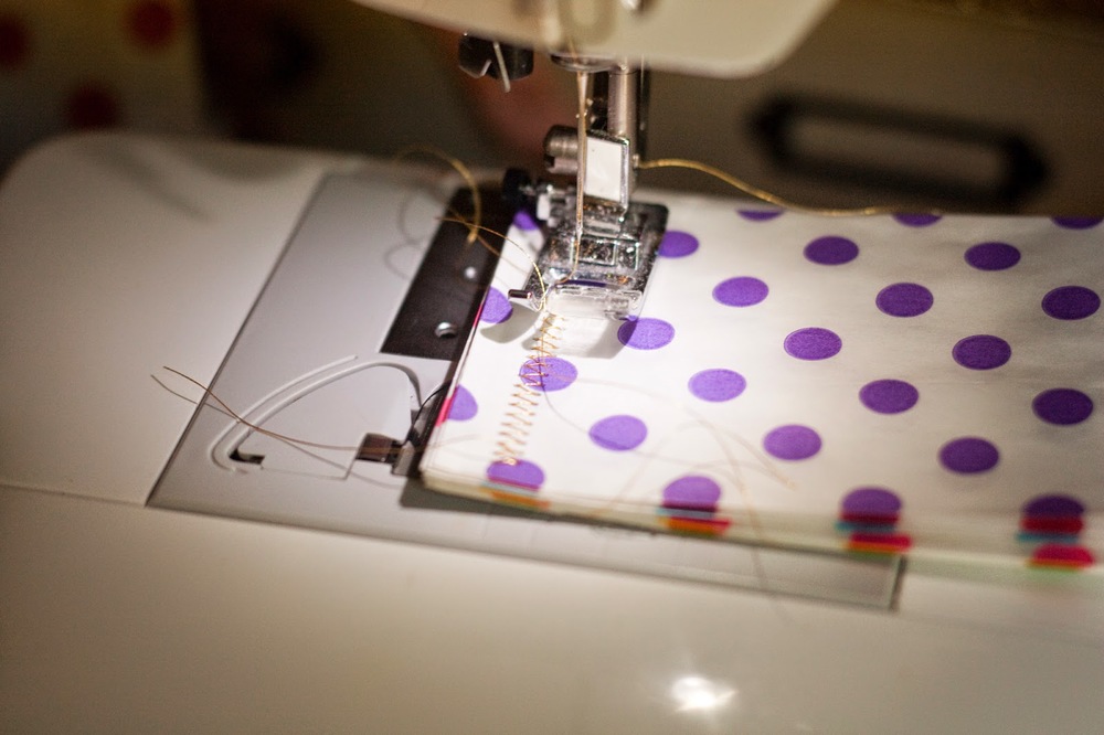
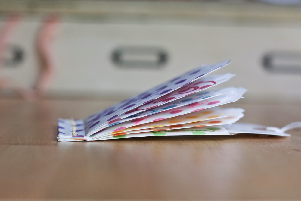
It's an easy approach. Simply score the tops of the tags and stitch above the score line using a sewing machine to adhere them to your background.


Now the tags work as flaps!


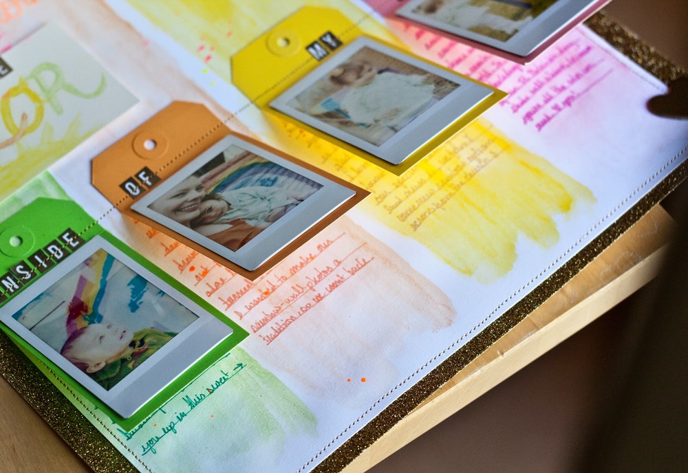
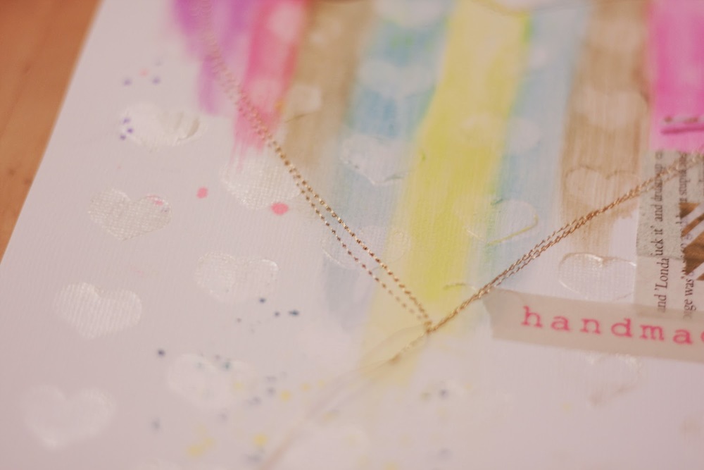
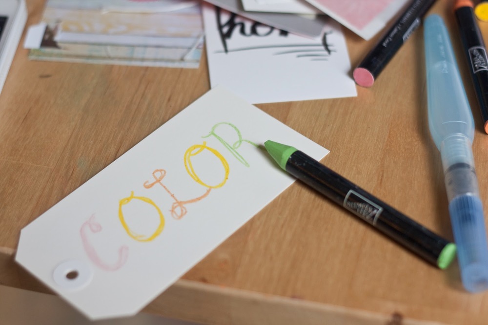
And I selected pens that matched the colors of my columns to keep the monochromatic feel going. (Except for the yellow. Learned from my title that yellow-on-yellow isn't ideal, so I went with a tan Sharpie.)

There you have it. This page was a fun afternoon art project, and I love the way the Whisker Graphic Tags work to both mat my photos and house my journaling. Thanks for that, WG!


Whew! That looks like more work than it is. Promise. I just like to really break things down for sake of explanation. I actually completed this page in under an hour, which is a massive record for me. I hope you'll give it a try. Or at least aspects of it. Especially those pretty Whisker Graphics tags. Thanks for sending them.

Birthday Card Quickie
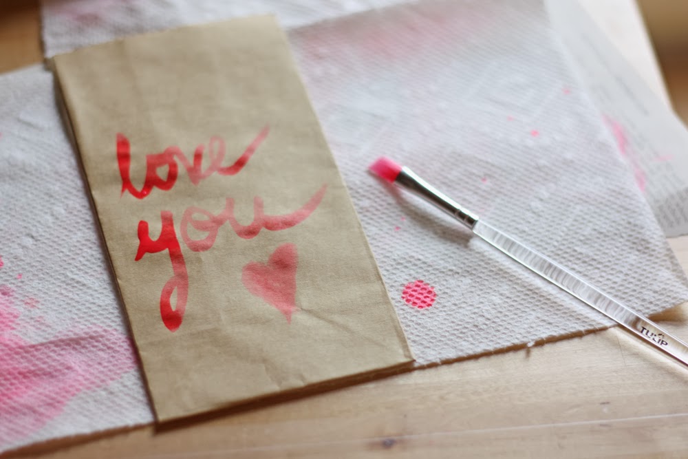
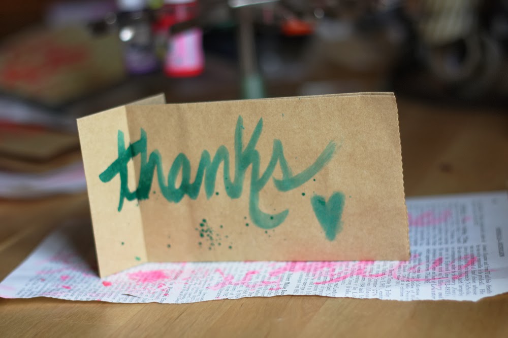
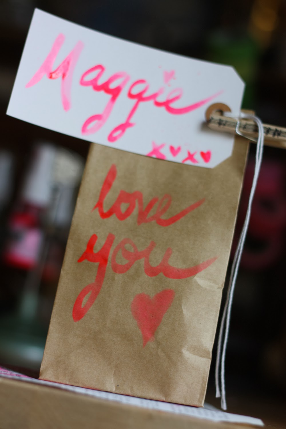
I could seriously play with Whisker Graphics goodies all day. (If only time were more accommodating), so I put together one more little project. This time, using these amazing bitty treat bags.

Image credit: Whisker Graphics


It's a little flip, interactive birthday card. It's for a sweet two-year-old, so I wanted to make it colorful and fun. Enter: doodling!


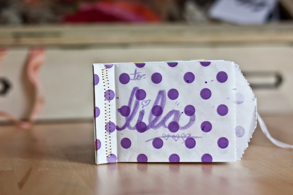
For her name on the front, I simply used the brush-script approach I've so enjoyed these days. For the inside pages, I turned to my awesome Sharpie assortment. Gotta love da Sharpies!


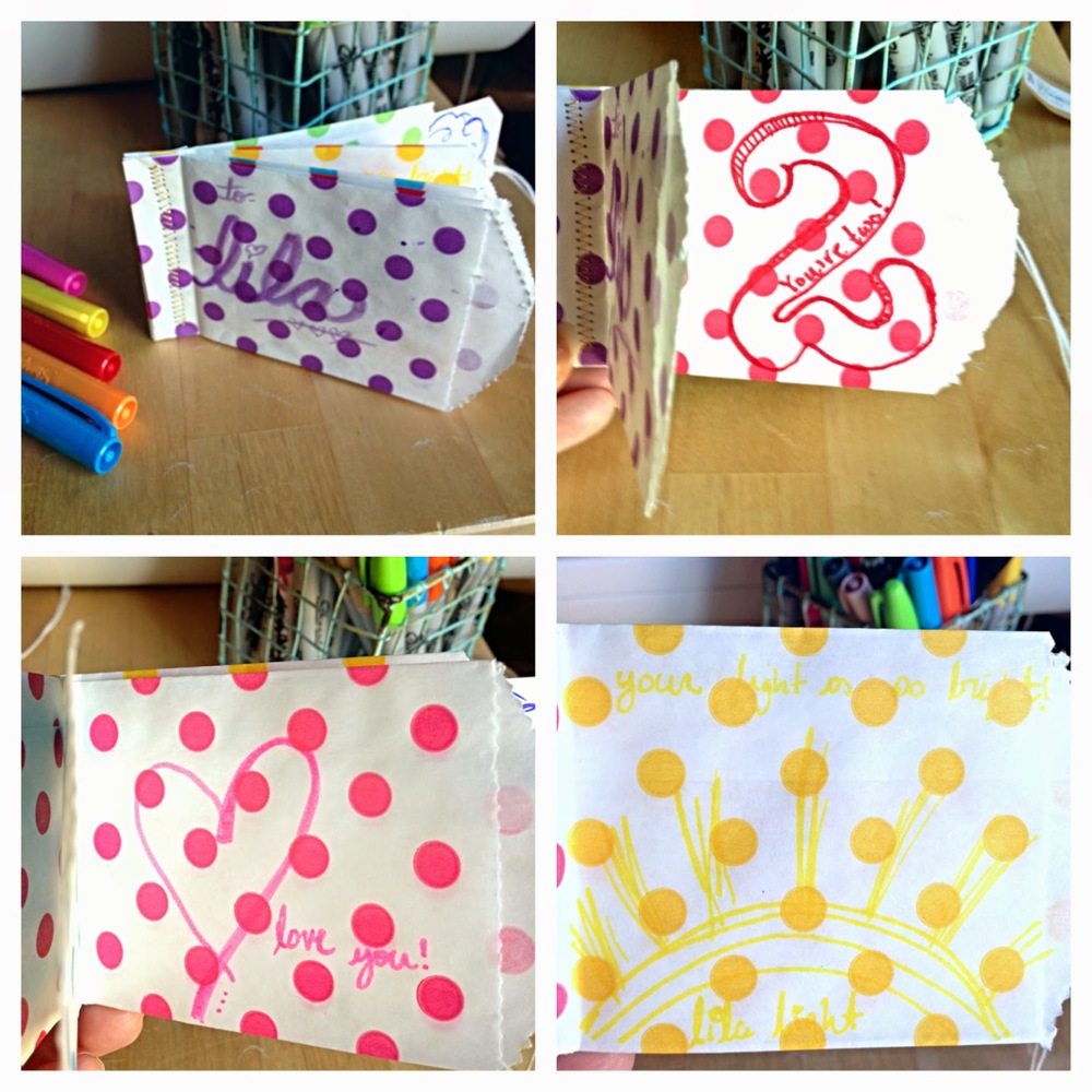
Creating the pages is as easy as stacking the bitty bags evenly on top of one another and sewing along the left (closed) edge. I used a zigzag stitch for extra reinforcement.


I had the idea of tucking a Whisker Graphics tag (large) into each pocket but found I didn't need to after doodling on each bag front, so I saved that surprise for the last pocket, where I placed a little love note.

I'm definitely going to take this card approach again soon, as I can see it being an awesome gift-card holder, money holder, etc. And it was so super easy and fun to make. What a treat!

Thank YOU for stopping in today! And thanks to Whisker Graphics for inviting me to be part of their May fun. Between my Mother's Day card and these projects, I've thoroughly enjoyed myself. Your goodies rule!

Cheers!
Megan

Quick Follow-up Question: I'm currently preparing an interactive card class (so fun!). Tell me, would you make a card out of treat bags like this (and this)? Your feedback on my last post was SO helpful (thank you!) that I thought I'd seek it here as well. Many thanks!

The Heart of My Art (and a NSD giveaway!)


Hello and welcome! If you've made your way here today, I'm willing to guess you're either a member of my family or a scrapbooker? Safe bet? I hope you're here seeking Nat'l Scrapbooking Day (NSD) info, as I have some brilliant celebratory business for you.

Today's Happy Happenings!

1. Big Picture Classes National Scrapbook Day 10K event is happening now. As a member of their 10K Team, I know I can't wait to add a layout or two to the Instagrams. Will you? Still on the fence? Well, there are prizes involved, and this is Insta-history in the works, friends. Need I say more?


2. Scrapbook & Cards Today: Nope, it's not Monday, but it is NSD, so I'm delighted to be paying Scrapbook & Cards Today an extra visit this week, sharing this layout and giving away some awesome delights. More on the layout in a moment!

The Heart of My Art by Megan Hoeppner. Supplies: Cardstock: American Crafts; Textured paint (Glimmerz): Shimmerz; Heart stencil: Heidi Swapp; Pigment sticks (Gelatos): Faber-Castell; Washi tape: Hazel & Ruby and Paper Source; Glassine bag: SRM Stickers; Stickers: Fancy Pants Designs; Spray ink: Studio Calico; Shipping tag: Office Max; Baker's twine: Whisker Graphics; Pens (Gold Sharpie; White Gelly Roll): Newell Rubbermaid and Sakura of America; Photo: Fuji Film (INSTAX Mini); Other: Gold thread. 


3. Giveaway! Yes, it wouldn't be a holiday without a scrapbooking prize, so I'm offering a mystery box full of scrapbooking goodies to one lucky commenter on this here post. Simply leave your comment between now and Tuesday, May 6, including your email address, for a chance to win. Excellent!

Image credi


Okay, back to my The Heart of My Art layout. This was a first for me—going super mixed media with a page. But it's about art, so I wanted to give it a go. if the idea interests you, here are a few of the steps I took, broken down:


Do It To It

1. I used the Heidi Swapp heart stencil that I recently purchased while at the Portland Creating Keepsakes Convention as a background.


I paired it with this amazing jar of Spun Sugar (white) Dazzlerz by Shimmerz to create a cool, textured, almost watermark effect across the back of my page. Dazzlerz are gorgeous, smooth, paints that have a heavier texture than a basic paint. They are M-A-Zing!

Image credit: Enchanted Dreams Shop


2. Inspired by this cute dress (from Target) I bought Maggie for my Aunt's surprise party last month...


I wanted to create a similar watercolor/heart look, so I started by drawing a heart on the now dry heart background using my beloved white Gelly Roll by Sakura.


Then I drew strips of color down the heart, with more color towards the top of the heart, using my Faber-Castell Gelatos—another awesome product!


3. Using a paintbrush and some water, I blended the Gelato color columns down the length of my heart, adding more Gelato where I felt it needed it.


4. Keeping with the paintbrush business, I then wrote the word "art" on an SRM Stickers glassine bag, using my spray ink, just as I did in this tutorial. This is something I'll definitely be doing again. Loved the look on the glassine!


5. Back to the layout, I added a strip of some of my fav washi, the Fat Roll by Hazel & Ruby, to the side of the page, layering over some misted book paper, which I tore from a book. I then added another strip of gold washi in a slightly thinner size.


Secret revealed: See that bit of black peeking out from behind the book paper? Yeah, that's an area of brush script that didn't go so well. No need to start over, however. No way! I just improvised and this book-paper/washi grouping was born.

6. Once the glassine bag was dry, I positioned it to the layout, making sure to only place my adhesive down the center, backside of the bag so it wouldn't show. I then added a strip of my new "handmade with love" washi tape from Paper Source. Gosh, I love this tape!


7. Time to sew! I added some machine stitching using my fav gold metallic thread, following my white Gelly Roll lines of the heart. I purposefully went outside of those lines a bit to keep it less linear. And I purposefully stitched over a bit of the bag and book-paper row to make the elements feel more connected on the page.


9. For the word "The" in my title, I simply wrote using a metallic gold Sharpie. It took a few coats to make it really show up well.


10. Wanting to enhance the "art" effect a bit more, I added some spray-ink splatter by removing the nozzles of my Mister Huey's and lightly tapping on them while holding them over the coordinating color column in the heart.


11. I added the words "of my" at the top of my tag using tiny stickers from Fancy Pants Designs. typed my journaling on a 2"x4" shipping tag, using my typewriter. I like the way the black letters slightly show through the glassine bag, both acting as a subtle print (to complement the book paper) and indicating there's a story in waiting without putting too much of my words out in the open. This was a personal story to tell, and I didn't want too much of it revealed on the surface.


12. The HEART of my ART, when it comes right down to it, is preserving our stories from my Maggie and her future sibling(s), so I simply added an old Instax Mini photo  taken of me while pregnant with Mags to complete the page.


For more on the significance and story behind this page, I hope you'll check out my post today on the Scrapbook & Cards Today Magazine blog. And don't forget to upload the fun you create today on Instagram with the hashtag #NSD10k (or in the BPC gallery). Both the magazine and BPC are offering pretty sweet prizes today, so there's even some added incentive in there for ya! :)

Oh, and don't forget the ol' goodie box o' delights being offered here. Hope you'll enter.

Happy NSD, friends! Thanks a bunch for making my blog a small part of your celebration today!

Cheers!

Brush Script: My Attempt


If you came to brush up on the latest there is to know about the art of creating a brush script, you're probably in the wrong spot. Scratch that—you are in the wrong spot. But if you came to see a novice test her hand at this art of creating a script font using liquid color, I'm happy to welcome you aboard!


Over on the Scrapbook & Cards Today blog, I share a great deal about the up-and-coming trend of brush script. I invite you to take a look for more about products available, trend experts and artists, and even classes being offered on creating this cool look.

Painting at Grandma's house. Circa... 1988 (ish).

Here, I'm simply going to explore a few self-taught approaches to creating my script using a paintbrush and two different forms of ink: spray and dye. I've always LOVED playing with paint and paper, so this was a fun world to explore.

Spray Ink Painting
Let's start with spray. These are the tools I used:

Mister Huey's spray ink by Studio Calico; shipping tag from Office Depot; paper towel c/o Mr. Brawny; Tulip paintbrush by iLovetoCreate

First things first—the ink. I simply unscrewed a bottle of my Mister Huey's spray ink and dipped my brush right in. No muss. No fuss.


I practiced on basic shipping tags, though any paper surface should do. Ideally, I imagine watercolor paper would be the way to go, but I'm not certain about this. And I didn't have any on hand, so the shipping tags would have to do.


As you can see, it takes some practice to get the hang it. Good thing I have a massive box of shipping tags, eh?


I thought it would be fun to turn the tags into thank-you tags to go with the handmade goods I occasionally sell, so I set to writing many "thanks!"


To create the splatter effect, I simply held the nozzle of my Mr. Huey's bottle above the tag and tapped on in . I did this after I wrote "thanks."

I liked practicing the same word over and over for a few reasons:

1. I could compare and contrast outcomes as I painted at different angles/different amounts of pressure/different quantities of ink/etc.

2. I could see how the effect would change with different ink colors.

3. Like snowflakes, no two pieces of brush script art are going to be identical. It's fun to see how they each get their own splash of personality.


This hobby is so fun, I even managed to convince Cory to try it with me. He's a good sport!


I love how everybody's handwriting is going to make their brush script unique!


Yes, it was a regular family affair.


Eventually, I spread my wings and tried other surfaces, such as little gift bags.


Now, all I needed was a little clothespin (Crate Paper) to make a Valentine's Day package for Miss Maggie D.


From bags, I decided to get real carried away and go multi-color with my strokes. Whaaaaat?!? Yes, it's true!


To do this, I would suggest starting with the lightest shade and progressing to the darkest to avoid ink cross contamination.


A few things I picked up along the way:

1. Drag the brush at the beginning and end of words to enhance the look (like the U on my bag above). It looks more hand-painted this way or something (vs. making a clean cut at a word's end).

2. If you're using a flat brush, as I was (probably not the ideal choice), hold it on its side for a finer font.

3. Be careful where you start and stop. The start/stop marks will show. I did my best to complete an entire word before lifting my brush, and then I'd simply go back over areas as needed. NOTE: Don't over go-over. You can quickly add too much color by going back over. I messed up many a tag this way.

Know Before You Go
As I've said, I'm far from a trained expert on the matter. If you're seeking more formal training (and who could blame you?), I suggest you check out Studio Calico's new Life Scripted online class, happening now. It looks like lots of fun, and students have had great things to say about it.

Image credit: Studio Calico
Ink Pad Painting
Back in the day, I worked for Stampin' Up!, where I learned this cool tidbit—If you squeeze your stamp pad when it's closed, a pool of ink will form in the lid.


Okay, maybe "puddle" is the more accurate word, but it's enough ink that you can dip your paint brush and use it to try a round of scripted painting.


So I dipped a toe... errr, brush, and tested the dye-ink waters.


How does this compare to spray ink? Let's pro and con!

Pro: It's easier to control because your brush is dryer.
Con: It has a less artistic look to it (in my opinion).
Pro: It's more even coverage (if that's the look you seek).
Con: It's harder to see.

Hmmm... I suppose there's a time and a place for both approaches.

I then decided to add little hearts to my envelope. Here's how this is done. First, hold your brush at an angle, slanting it on the diagonal, and rub it back in forth on the paper.


Repeat. This time, going at the opposite diagonal, to complete the heart.


You don't have to reapply ink to the brush between each heart. If you don't, some will have less saturation and others more, giving the project more depth.


Will, that's all she wrote. While this is far from the Brush Script-ures, I hope my trial and error process has offered you some insight as you approach your own projects. And I'd love to know which approach— spray ink or ink pad — you like better.

Thanks for stopping by!


Cheers!